이전 글:
2020/03/31 - [HTML and CSS] - [HTML] 18. HTML 이미지(2)
2020/03/24 - [HTML and CSS] - [HTML] 17. HTML 이미지(1)
HTML에서 이미지는 매우 그 활용법이 다양하기 때문에
내용 또한 복잡하다.
앞에서는 이미지의 기본적인 설정 방법과 이미지 맵에 대해서 배웠었다.
그럼 이제 남은 것은 무엇일까?
이번 장에서는 이미지를 배경에 삽입하는 방법을 다루고,
끝에서 스크린 사이즈에 따라 이미지를 교체할 수 있는 <picture>함수에 대해 간단히 언급할 것이다.
HTML에서 이미지를 배경으로 넣는 방법은 간단하다.
CSS 속성 중의 하나인 background-image를 사용하면 된다.
우리는 style 속성에서 background-image를 설정함으로써 특정 구간에
배경을 이미지로 설정할 수 있다.
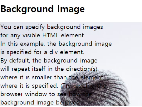
다음 예시를 보자.
<!DOCTYPE html>
<html>
<body>

<h2>Background Image</h2>

<div style="background-image: url('img_girl.jpg');">
You can specify background images<br>
for any visible HTML element.<br>
In this example, the background image<br>
is specified for a div element.<br>
By default, the background-image<br>
will repeat itself in the direction(s)<br>
where it is smaller than the element<br>
where it is specified. (Try resizing the<br>
browser window to see how the<br>
background image behaves.
</div>

</body>
</html>
만약 당신의 'img_girl.jpg' 파일이 작성한 .html의 파일과 같은 폴더에 있다면
다음과 같은 형식으로 배경이 설정될 것이다.
그리고 이것은 다음과 같은 방식으로
모든 <div>에 작성된 글에 대해서 background-image를 설정 할수도 있다.
<!DOCTYPE html>
<html>
<style>
div {
  background-image: url('img_girl.jpg');
}
</style>
<body>

<h2>Background Image</h2>

<div>
You can specify background images<br>
for any visible HTML element.<br>
In this example, the background image<br>
is specified for a div element.<br>
By default, the background-image<br>
will repeat itself in the direction(s)<br>
where it is smaller than the element<br>
where it is specified. (Try resizing the<br>
browser window to see how the<br>
background image behaves.
</div>

</body>
</html>
만약 전체 웹 페이지의 배경을 이미지로 설정하고 싶다면
<div>가 아닌 <body>의 background-image에 이미지의 url을 달아주면 된다.
<!DOCTYPE html>
<html>
<style>
body {
  background-image: url('img_girl.jpg');
}
</style>

<body>

<h2>Background Image</h2>

<p>By default the background image will repeat itself if it is smaller than the element where it is specified, in this case the BODY element.</p>

</body>
</html>
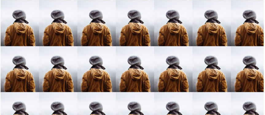
만약 배경 이미지가 당신이 설정한 <body> 혹은 <div>보다 작다면,
이미지는 자동으로 수직, 수평으로 반복해서 나열되게 된다.
다음과 같이 말이다.
만약 배경 이미지가 반복돼서 나열되는 것을 막고 싶다면
background-repeat 속성을 정하면 된다.
<!DOCTYPE html>
<html>
<style>
body {
  background-image: url('example_img_girl.jpg');
  background-repeat: no-repeat;
}
</style>

<body>

<h2>Background No Repeat</h2>

<p>You can avoid the image from being repeated by setting the background-repeat property to "no-repeat".</p>

</body>
</html>
위와 같이 no-repeat라는 간단한 명령으로 반복을 막을 수 있다.
하지만 반복을 막으니 이미지가 너무 작아서 전체 배경으로 쓰이기 어색할 수 있다.
그럴 때 사용하는 것이 background-attachment와 background-size 속성이다.
아래를 보자.
<!DOCTYPE html>
<html>
<style>
body {
  background-image: url('img_girl.jpg');
  background-repeat: no-repeat;
  background-attachment: fixed;
  background-size: cover;
}
</style>
<body>

<h2>Background Cover</h2>

<p>Set the background-size property to "cover" and the background image will cover the entire element, in this case the BODY element.</p>

</body>
</html>
위에는 새로 생긴 설정이 두 가지 있다.
바로 background-attachment: fixed와 background-size: cover
background-attachment에 fixed는 이미지가 마우스 스크롤 휠에 따라서 움직이지 않게 고정하고,
background-size에 cover는 전체 요소를 채우게 해준다.
위와 같이 사용되면 cover하는 요소가 <body>이기 때문에 전체 웹 페이지를 이미지가 가득 채우게 된다.
하지만이때 이미지의 비율이 바뀌지는 않기 때문에 전체 웹 페이지의 비율이
이미지의 비율과 일치하지 않으면 어느 정도는 잘리게 된다.
만약 비율을 맞추고 싶다면 다음과 같이 코드를 변경하면 된다.
<!DOCTYPE html>
<html>
<style>
body {
  background-image: url('img_girl.jpg');
  background-repeat: no-repeat;
  background-attachment: fixed;
  background-size: 100% 100%;
}
</style>
<body>

<h2>Background Stretch</h2>

<p>Set the background-size property to "100% 100%r" and the background image will be stretched to cover the entire element, in this case the BODY element.</p>

</body>
</html>
위와 같이 background-size에 100% 100%로 가로 세로 길이를
요소의 비율에 맞춰줄 수 있다.
여기까지가 요소에 배경을 넣는 방법이다.
앞에서 배경으로 색깔을 넣는 법을 배우기도 했지만,
요즘 많은 웹 사이트들이 이미지를 배경으로 쓰는 추세이다.
그러므로 이미지를 배경에 적절히 활용하는 방법은 알아두면 도움이 된다.
그럼 여기에 더하여
HTML <picture> 요소에 대해서 간단히 언급하고 넘어가도록 하겠다.
<picture> 요소는 웹 사이트를 방문한 사용자의 스크린 사이즈에 맞는
그림을 내보낼 수 있게 해주는 요소이다.
이 요소에 대해 짧게 언급하려는 이유는, 최근 추세가 반응형 웹 사이트로 그림 자체의
크기가 방문자의 스크린 사이즈에 자동으로 조절이 될 수 있는 기능이 구현되고 있기 때문이다.
그러므로 <picture> 기능은 요즘은 거의 사용하지 않는다.
<picture>기능은 다음과 같이 구현된다.
<picture>
  <source media="(min-width: 650px)" srcset="img_food.jpg">
  <source media="(min-width: 465px)" srcset="img_car.jpg">
  <img src="img_girl.jpg">
</picture>
<source> 요소들을 여럿 포함하고 있어서 다른 사이즈의 스크린에 대해서
다른 이미지를 불러오게 할 수 있다.
중요한 것은 <source>만 사용하지 말고 마지막에 꼭 <img>를 사용하여,
위에 <source>에서 지정한 media에 맞지 않는 스크린에는 꼭 <img>를 띄어주어서
어떤 이미지도 나타나지 않는 현상을 방지할 수 있도록 해야 한다.
<Picture>함수는 크게 두 가지 이유로 사용된다.
- 스크린 크기에 따른 이미지 크기 변경 (작은 스크린에는 작은 이미지, 큰 스크린에는 큰 이미지)
- 이미지 확장자 변경 (브라우저가 특정 이미지 확장자를 지원하지 않을 경우 다른 확장자로 변경)
확장자 변경의 경우에는 다음과 같은 느낌으로 사용한다.
<picture>
  <source srcset="img_avatar.png">
  <source srcset="img_girl.jpg">
  <img src="img_beatles.gif" alt="Beatles" style="width:auto;">
</picture>
<picture> 앞으로 쓸 일이 없을 수도 있지만,
언제든 알아두면 나중에 특정 확장자가 문제 될 때
대비책으로 다른 확장자의 이미지를 넣어둘 수 있기 때문에,
안정적인 웹 사이트 운영에 도움을 줄 것이라 생각이 된다.
이미지에 대한 세 개의 챕터가 끝났다.
이 정도로 이미지를 다룰 수 있다면
웬만한 웹사이트에서 이미지를 원하는 대로 삽입할 수 있을 것이다.
하지만 이미지 위치 배정 또한 중요한 요소이기 때문에,
이러한 요소에 대해서는 나중에 HTML Layout을 참조하면 좋을 것이다.
'HTML & CSS' 카테고리의 다른 글
| [HTML] 18. HTML 이미지(2) (0) | 2020.03.31 |
|---|---|
| [HTML] 17. HTML 이미지(1) (0) | 2020.03.24 |
| [HTML] 16. HTML 링크(2) (0) | 2020.03.24 |
| [HTML] 15. HTML 링크(1) (0) | 2020.03.23 |
| [HTML] 14. HTML CSS(2) (0) | 2020.03.19 |